Thursday, 11 December 2014

Design Research Portfolio-Movie Poster

Research 

Creating a movie poster using Photoshop. I was able to do some research on 3 movie posters that i liked and talked about why i had liked them. From there i was able to develop my own initial ideas.

The film Poster for Avatar was made in 2012. The poster has a range of images that are overlapped to create a story just from an image. I like the usage of colours which makes it eye catching to the audience. I feel that the usage of overlapping images is a good technique and that i would use this with my final movie poster. I enjoy the concept of the poster and feel that this has inspired me to use similar techniques.


The Avengers Film poster, With this poster i feel that it demonstrates what it needs to show, for example the usage of characters in action signify that the film is action-packed. The usage of colours are eye catching and bold which makes it interesting for viewers to look at. This is a technique that i would incorporate within my own work because i like to create something that is different and appealing to the eye, which i believe that this poster has achieved. However i feel that this poster is busy and has a lot of things going on with it. I will avoid using to much characters just to ensure that the poster doesn't look busy.


The man of Steel poster, this poster is appealing to the eye because the usage of simplicity. Showing the main character on the front behind a demolished background shows that this film is full of action. Another technique that i would like to use because i want to demonstrate what my film is about using these key techniques. I like the way the character is positioned at the front of the poster. This technique symbolises his authority and what role he plays within the film. However i dislike the dull colours used and believe that this poster could be enhanced with the usage of brighter colours, i do believe dull colours have been used to fit the theme but feel that more work could be done to make this 100% pleasing to the eye.


Ideas

Creating a mind map of ideas helps me generate ideas that i can then later on develop. Overall i decided to create a film poster for The Man Of Steel and create the next hit movie with this. I had also experimented with the concept of Minions from the film Despicable me. 

This was an experiment as i was planning to make a Minion movie poster. Due to not having much inspiration i decided to use this only as an experiment. I had created the image all from scratch using the Minion as a template. I created the Flash clothing all from hand, which i was impressed with. The concept behind this was to create a Minion version of the Marvel films, however i thought this was to complex of an idea and decided to create a Superman poster instead.

Drawings 


Idea 1) This idea was to create a 3D image that portrays Superman smashing through glass. I really like this idea due to the fact that it makes the image appealing and different towards any other poster. Instead i would have his face showing within the smashed out segment to show who the character is and what his role is.


Idea 2) This is an idea showing Superman within the city, This shows who he is, what he does and what his role is. I then thought about changing the name to the Last Stand because i thought it would be a good idea to show the city in destruction. A technique of symbolisation which i picked u from my research. However i don't like the concept due to the fact that it looks simple and is not effective. I will however take the name and the usage of him being in the middle into consideration.  
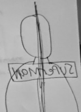


Idea 3) This concept was to show two sides to the character, a good side and a bad side. I felt like this could do with more development but i do like the idea of having both a positive and a negative side. I feel that all three drawn concepts are a good idea and thought about merging all three to create something more unique and unusual. 


Final Concept

As a final concept i was able to merge three ideas to create one final idea, I feel that this is a unique idea and that it would portray a lot going on with the technique of being simple at the same time. Here is the step by step process i had to make to create the final outcome towards the movie poster.

Overall i feel proud of this piece of work, this is due to the fact that i was able to incorporate three concepts into one making something else more unique and pleasing to the eye. I really like the 3D concept as this is a strength of mine as i have used this technique within previous Photoshop work. One suggestion i feel that i can make is that i could have done more with the text/ Font. The reason behind this was because the Mac i was using did not let me install fonts from the web so to correct this i had to make do with the fonts that were provided within Photoshop and experiment with those.
Overall i am happy with the end outcome and feel that the poster achieves its purpose. I ensured that the image was 300DPI and was RGB.

Step By Step


Text experimentation

As an experimentation we created a flyer with Photoshop to demonstrate the skills we had and what we knew. The process of making this was quite simple as i am use to using Photoshop quite a lot. I was able to align the text within each other. This is a good technique to use as it is used within print and creating magazine covers.

I was then able to create a blokeh background by using the brush tool and personalising the presets to create the final out come. The whole idea behind this was to create a professional looking flyer even though this was an experimental image.

Design Research Portfolio-Logo

The second task that we had to do was to research and create a logo that would be within a film and create a sequel.  My first step was to research logos to get an idea of how they are made, what they look like and the techniques used. I may want to use techniques within the researched logos to then be imbedded within my final ideas.

Transformers logo from the film "Transformers 2" is a logo that has been made with a lot of textures and layers to create the final out come. I really like the usage of the textures to create a metal feel within the logo. It gives the logo more character which i would like to incorporate within my logo final idea. How ever i feel that the logo is dull and could do with brighter colours but in some sense i guess darker colours go with the theme of the film.


The Aliens logo is created with the usage of a neon technique. The way that the logo has been created is by using an outer glow and less transparency. This gives a futuristic feel towards the logo which i believe the creators intended to do. The usage of symbolism is an amazing technique which i would like to encorparate within my final idea. The negative point i have to make about this concept is that the logo is way to simple and i feel the it could do with a lot more origanality and thinking outside of the box. I believe the developers of "Alien stick to a specific theme within all their concepts. An idea i feel that i could also use to have a constant running theme that relates and interlinks with one and other.


   The Avengers logo from the film "The Avengers". This Logo concept is an amazing idea which always excites me when i see the logo. I like the technique of having a outer glow around the text creating a form of light making the text readable. The usage of having big bold fonts makes the logo eye catching and attractive towrads the audience. I believe a lens flare has been used within the image (the light) to create a futuristic feel towards the logo. Another use of symbolism. I would like to encorparate this concept within my final logo idea because of the futuristic feel. Negative point i have to make is that maybe the image could do with more light only to make it more readable.


Development Process:


I created a mind map of ideas of what logo i can create. I decided to create a logo for the film Transformers. I want to recreate the logo giving my own feel and concept. The next step was to come up with the concept ideas. I created rough sketches to portray my ideas and what i was thinking.

Drawing Concepts:

Idea 1)
First concept idea is of the face of the Transformer and having the title at the bottom of the image. This is the original idea that was used within the Transformers movie. I like this idea due to having an image as well as the text. The concept of having the best of both.


Idea 2)
The second idea is of the Transformers title. This concept was to show the title rather than an image. I believe this idea is not as interesting and is boring. There is only so much you can do with text.


Idea 3)
The third idea i created was an idea of having the letter T over the Transformers face. Even though this is an original idea i still felt that this was not a good idea mainly down to the fact that the T may block some of face which doesn't make the image as effective.                          


Working on Illustrator 

Creating the logo i used Adobe Illustrator, the reason for this is that Illustrator creates vector images which means that the images are not pixelated. This gave me an advantage of making the image as detailed as possible. If i created the Logo via Photoshop, the logo would become pixelated due to the compression of a JPEG.

Creating the Logo


Step 1) I created a new canvas, A4 size.
Step 2) I then made a new layer. With this layer i used the pen tool to create the Transformers face.
Step 3) Drawing each individual shape for the face, once i was able to draw each shape, i then merged all shapes together (grouped all images).
Step 4) Once all images were grouped to create one image i then inserted a gradient over the vector. 
With the gradient i was able to create a metal texture over the face. quite similar towards the original  idea that i wanted to do. 
Step 5)  I then added on a new layer a textual font with the words "TRANSFORMERS".
Step 6) With the text layer i made the outline of the text a gradient, similar to the vector image created earlier. After that i then changed the inner layer of the text to a transparent view to create the outline of the title. 
Step 7) On a new layer i then created a black box, with this black box i used it as the background layer. With the black box layer i then sent it to the back to give me my final outcome.


As you can see the difference between the original  concept and my idea, you can see how it is different. When making the face i though i would add my own ideas to it to make it more different. For example the curves around the face are more straight creating a neater feel to it. On the other hand i wish i could add textures into Illustrator to then create a metal texture. how ever i was able to use a gradient to manipulate this technique. Overall i am pleased with the final outcome but believe i could have improved more on the text, creating more of a 3D element. I felt that working in Illustrator i was limited from the tools and what i could have done within Photoshop. This was an amazing project and belive my Illustrator skills have grown from working on this assignment. 

Tuesday, 9 December 2014

Design Research Portfolio-CD COVER


Danger Doom CD is a simple CD cover with the usage of vector images to create the final out come. I love the way it has been made, making it simple and yet effective with the technique of using bright eye catching colours, this is a type of contrast that makes it appealing towards the audience. I like how the text is bold and the "D" in each word is of a different colour. This has been done to give another meaning to the word "DANGER DOOM" this makes the label unique. I may consider this technique to add more character towards the title.


MUSE CD is a brilliant cover, the reason why i think this is due to the technique of using smoke to create a image of a man and a woman. The usage of colour goes with the album theme because the music itself is colourful and upbeat. In some sense this is a form of symbolisation. A negative point i have to make about this CD idea is that the maker of the cover should have experimented more with
the Logo or CD name, rather than placing it inside a purple box. Other than that i feel like this idea sends off a good sign of what the music may be like. This is a technique id like to use, to be able to symbolise what the CD cover is about towards the audience.

This one of my favourite mix tapes by The Weeknd, The reason why i have chosen this cover is due to the pop art feel. I feel like this is an original  idea and creates a form of art. The disadvantage towards this technique is that it gives an old feel towards the cover and not a modern feel. The colours used are dull and could be more eye catching. When creating my own CD cover i will ensure that i avoid making my cover dull and instead more bright, modern and eye catching.


When it came to creating my own CD cover it was mainly down to a choice of random selection, from this we had to create a cover that contained an image, title and a quote of some sort. This was a test because i have never really created something out of random choice, this proved to be a challenge. I created the CD cover on Photoshop and slowly developed t from there. (As shown below).


As this was a task the depended on randomness, i was able to grab my Album title from; http://en.wikipedia.org/wiki/Special:Random.

For the quote i had to go to; 

Finally, for the Album cover i had to use; 

This was the outcome of the technique of randomisation.

Development of the CD cover and final outcome:


With the CD cover idea i believe it was a fun and interesting task, however i am not to sure about the concept due to the idea of work from random images and so on. In some way i look at this first task as an exercise helping me generate more ideas making me think out side the box. If i had the choice of choosing my own images, i would have done it a lot more differently which something id be use to, so in some way doing it like this makes me open up to different concepts.


Sunday, 6 April 2014

Ethnography in Social Networking


For Mine and Georges Ethnography project we conducted an experiment where we first decided to produce a survey where we would be asking each other questions about social networking. After trying this we though that we should step it up a notch and actually try something different.

So George decided to come over to my house for the day and told my to confiscate my phone and laptop, In this way i would have no chance accessing my social networking sites.

The purpose of this experiment was to see how i would cope without using my phone or laptop for the whole day. On the other hand we had my mum to use my accounts and to try out for every 10 minutes within each our to use the social networking sites.

My experience within this project was that i felt like a piece of me was missing, i felt like time because normally i would be on my phone passing time on Facebook or Instagram. i felt very unsettled and that for me to pass time i ended up tidying up my room and staring at the fish tank for the majority of the day. There were times were i reached into my pocket for my phone to have found it was not there. it was painful but i then realised how we take it all for granted and how we rely on social network just so that our day passes by.    

My mums experience from using my social networking site was that at first she found that she had to get use to it, as she is not use to how to operate or navigate through it my mum ended up liking things i wouldn't generally like on Facebook, for example how to make cakes, being a student i generally wound't want to make a cake and definitely not have it broadcasted on Facebook for all to see. My mum also found that she had "random" people messaging her and had no idea what the slag meant.

To conclude i felt that i needed to get by from using my phone and just to pass time, i don't feel like i'm an addict but maybe i need to chill out a bit from using my phone or laptop and maybe help out a lot more around the house.

My mums conclusion was that she found it rather interesting and a good way to catch up with old friends. She found new ways to communicate e.g Facebook message and found so many pages that could help her with her day to day activities. She now knows why the modern teen uses social networking to communicate to one and other, but she also said that if she had time she would use it more. If she wants to get in touch with someone she would do it by me as i know what i am doing...apparently.

Who's watching us?

Looking at case studies a am going to be talking about surveillance within Britain and whether as a whole it is a good thing or a bad thing. First looking at, What is Surveillance? Well my friend Surveillance is a way of watching people and getting away with it. Having cameras set up up in every direction it may sometimes feel like you are being violated just by having a camera in front of you.

Many argue that having surveillance is a good thing and can help keep the city safe. I agree with this but also feel like its wrong. I can give a personal experience that i have encountered within surveillance.

I was coming back from my breakdancing class, (yes i breakdance) around 6.00pm. As i was walking to the bus stop with my cousin we where approached by a pair of youths. At first they wanted some many, some me and my cousin simply said no sorry we don't. I don't think they liked that answer so they then started to follow us asking if we had weed on us, i have no idea why it seemed that we had weed on us as me and my cousin have never touched the thing. Again answering no they then started to chase us. We got beat up for no reason. Me and my cousin ran when the opportunity to flee came, so we did. A couple of days later we had reported it to the police. There answer was that they would check the CCTV footage around that area where it happened. After waiting 3 agonising weeks to get justice, we had no result as the excuse was that there were to many people and that it wasn't working around that time.

This personally made me mad, i was asking to myself, why do we have CCTV if there is no organisation or if it doesn't even work. We didn't have a leg to stand on because the two muggers could have been anyone, and to be honest when you are scared of someone you don't really take a minute to have a look at them because you are getting punched in the face. Anyway as i now finish my rant, i feel that having CCTV cameras are in a way pointless.

Advantages:

Let people know that they are being watched to prevent crime.
Help monitor certain areas of violence, graffiti and so on.
Makes it a safer place for pedestrians to go where they want without having to worry.

Disadvantages:
Sometimes they can be used to spy on people.
Makes them feel like they are being watched constantly.
Who knows who's watching on the other side.
Invading personal space.

Even though i strongly feel against CCTV, looking at case studies i have found that CCTV helps reduce the number of crime within each area, monitoring everyones moves. In the past there has been numerous cases where if an incident has happened, Surveillance came along to solve the mystery. This also enables CCTV images to be used within the media industry to create a greater emotional impact towards it's readers. In some sense when a crime is made and has been cracked, CCTV come and takes the title rather than looking at the case itself and within its own transcripts.

Surveillance has been portrayed within an ill manner towards the public audience. Yes it may be preventing crime but it also invades peoples private space. CCTV is now almost everywhere, for example Shopping Malls, Library's and so on, in some sense this is just a way for the government to say that yes they are fighting combat when really they are taking a back seat and watching everyone within there day to day routine.

The main question that we can all be asking our selves is that, can this continue and if so will it get worse as technology is increasing so are they ways around crime. Can we all cope with being watched. If i want to sit down and eat my Mc chicken burger would i need to worry about some random guy watching me eat, A pervert may be on the other side watching people. So you don't know whether to trust the police system because even the police have there odd characters.

Sources:
http://www.no-cctv.org.uk/faq.asp
http://whatiscctv.com/
http://content.met.police.uk/Article/CCTV/1400011385250/1400011385250


File Sharing

Torrenting

Looking at file sharing (peer to peer) P2P this has the same principle towards the copy Right Law. As much as we know it is Illegal to download and is thrown upon, yet we all still do it in some shape or form. A good example that i can give is, say like i saw a picture and i took a picture of that picture, that would still fall under the Copy Right Law, yet the quality and detail may not be the same. Pixelating    the image. In some sense that might then make it my own image as it may alter towards the original.

The question is, where do we draw the line?

So many torrenting sites are being taken off by the government and yet there is still away to access it. Im not saying i know how, but there are ways around this. A good example i can give is Pirate Bay.
As they were originally based in the USA, the whole site was shut down. This was no stopping them. What they did instead was to move to a country that didn't really care about the Copy Right Law and then branch out from there.

There is only a numerous ways around this that can stop people accessing these sites yet there is always a way around things. This is where i say again, where do we draw the line?

How is it not morally wrong?

I believe that file sharing is not wrong as it may help spread and help acknowledge the artists work towards the audience. This may help expanding there profits rather than making it less.

Even though Torrernting sites such as Pirate bay or Kickass torrents are not funded by the government, the profit to hold each of the torrenting sites up all come from shares and advertisements as well as its customers.

Many of my friends torrent and and go against the copy right law, I found that when you go to a party or a club even the DJ sometimes has music that he hasn't paid for and had illegally downloaded from torrent sites. Everyone does it now a days and its something that is becoming of a trend.

I don't think it hurts anyone as it has its negative and its positive side.

Sources:
https://www.staffs.ac.uk/legal/copyright/what_is_copyright/
http://wiki.answers.com/Q/How_much_does_Beyonce_get_paid_for_a_concert?#slide=2
http://www.p2pfinanceassociation.org.uk/
http://netforbeginners.about.com/od/peersharing/a/torrenthandbook.htm

Debate

Copy Right

First of all, What is Copy Right?

Copy Right protects ideas and concepts made by an indervidual. When a song, film or any sort of median is made it instantly has Copyright protection over the material. This keeps it protected from other people from using it for there own advantage or claiming it as theres. Copy Right is generally owned by the creator and if anyone wanted to use there material, they would need to notify them and request that if they can use it in a certain manner. If the composer agrees to it, then by all means he or she is able to use it. Using it without the permission of the artist may result into a really heavy fine for the person that has used it and is considered to be an act of crime.

For our debate we were split into teams that were for and against the copy right law and file sharing. We were split into fair teams and had to research good and valid arguments, in this way were had the opportunity to counter react towards our opposing team. We found that we were strongly against the Copyright Law and that file sharing should happen.

One of our main arguments towards why we should file share is that sharing a file towards another person should not be classed as not being something against copy right. The main reason for this is for example, if my neighbour had a brand new car that i wanted so badly, if i touched it, magically it would appear onto my drive. it is different from stealing as my neighbours car is also on his drive. This is the same principle for file sharing. It does not affect the artist or who ever owns it because in a way it helps spread the artists work. A good example that we used within the debate is how artists are able to upload files onto Sound cloud. This helps the audience try out the new and different music without them paying for it. If he or she likes the song or album they then have the opportunity to download the song or album for free. This is a clever idea as it helps share the artists work around making them recognised by others.

Once the artist has established himself he can then start charging for his music. On the other hand the profit that artists receive is not always from selling his or hers album. A good example that my friend George gave was that, Beyonce had such an amazing live concert that she made over $1.5 USD just from making a three song set from her live tour. This shows that profit can come from tours as well as merchandise.

Our opposing team argued that there should be a Copyright Law as it affects the artist. An example towards what they gave is if i made a story that was personal to myself and someone came along and copied word from word making it their own. How would we feel? In the same sense towards how the artist feels.

Our counter argument against this was not everyone can copy and make it there own. Our reason for this is that there are such things as remixing. This is where an indervidual has an artists song and adds more beats or changes the way it sounds, this then makes it there own as they have made it to how they wanted it. Sometimes it may not sound as good making the original sound better, this is a good advantage for the artist because the artists them selves is more unique and has there own set of skills.